CFBL
Ariane
Lucie Amélie Eloise
Largo, Alexis, Azat
Treacle Town
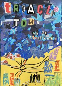
My first impression of this book wasn't ideal as I don't particularly appreciate the aesthetic of the cover (subjective). However, once you actually observe the colour and font choices you realise that they were decided wisely. For example, the orange sky gives off a vibe to tell you to stay away. On the other hand, the pink houses display a warm and safe vibe. And finally, my favourite part, the font of the book's name is bold, punchy and "rusty" to show that although it is not well known it belongs to them and they are proud of their origins. As for the story, I definitely liked the beginning that showed a close "gang". And Connor's discovery for his love of slam poetry was great.
Joseph T.
The Things We Leave Behind
The Things We Leave Behind is an extremely touching book all about finding a new home. It talks about the experience of Clem and her little sister, Billie, who both have no choice but to travel to the countryside because of a terrible dictator in London.
The book is interestingly arranged in sections instead of chapters, each of them with a special title that represents its main theme. The story also goes back in time in many parts, which allows the reader to discover more information bit by bit and to uncover the hidden truth behind one of the characters.
In my opinion, this book was the perfect length but still moving and emotional.
Nesrine
King of Nothing
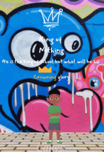
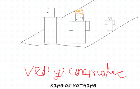
At first glance, I directly saw that the main character (Anton) is very narcissistic, and has a lot of confidence, which I find, is a very good way to see this book for the first time, as it gives us a perfect idea of what this book will be about. The covered purple background makes it very noticeable, and immediately caught my eye. Moreover, the crown shaped graffiti on the back wall on which Anton shows us that he is the "king". The book is about Anton (the main character) who starts questioning his life, after being forced to spend some time in his mothers workplace. The message that this book gives us is very inspiring, and interesting.
Anouk
King of Nothing
After reading this book, I had a whole different perspective of young people, especially teenagers or young adults, who frequent the streets and often associated with street culture and potentially including criminal activity. I understood that these individuals live in difficult situations and don't receive the education and manners they deserve, therefore they end up in the streets affiliated in drug selling and dangerous and illegal affairs. In this book, we identify the character of Anton, a teenager that lives alone with his mother and unfortunately his dad is locked up in prison. Anton doesn't obtain the needed manners and behaviour so he ends up with children with similar cases. Later on, after getting sent to a camp where his mom works, he starts to realise that the path he's living in isn't the right one and started a new type of life. In this book we understand that you might be in a difficult position but can still live a good life.
Nadim
Treacle Town
This book is a very deep and well-thought book about the depression, stress and mental take of a young person in an unfavourable neighbourhood. The book takes an unsurprising start at a close friend's funeral after he was murder by an opposing young team (gang). The book then takes a deeper look into the life of one of the young team's members, Connor. He is an insightfull young man who doesn't have the best start to life. His friend's funeral is the turning point in his life, the epiphany where he decides that there has been enough violence and hate and that he needs to start a new life and start looking and caring more about himself. This is the moment where Connor finds slam poetry and decides that it is his way out of treacle town. In the end, he goes to a slam poetry meetup and it goes very well. Unfortunately, while Connor is doing slam poetry, his friends the members of the young team went out for revenge of their dead member and one of them found their end as well. In conclusion, this book is a bit slow at the start and becomes more interesting and exciting towards the end. I thoroughly recomend it for avid readers and people who like insightful books on deep topics.
Louis
gaspard
Günther
Sixtine
King of Nothing
This is a very emotional and inspirational book. We discover the journey of Anton changing his perspective on popularity, friendship and family. The plot was amazing with the death of his grandma showing him that there are more important things than popularity and the release of his violent farther from prison showing him that if continues through his sexist and masculine point of view he might end up like him in prison. Anton is also sent to a scout named the happy campers where he develops an unusual friendship to Matthew who saves his life. The use of slang words made us relate to the story even though it was sometimes a bit much. The ending is bittersweet as Anton saves the shelter he has been working on from his old friends. All in all I realy liked this book as I found the plot interesting and the story inspirational.
Leon
The Things We Leave Behind
I really liked the book even though the beginning was a bit long.At the start, it was hard to get in it and I didn't understand everything.But, i continued to read and i started to really appreciate it.I think that the book kept getting better and better and that the description was insane.Sorry for the spoiler, I even cried so much when I learned that Billie was actually dead.I was so sad she was my favourite character Also, the cover it matches so well the book and now I understand the little origami birds.I would recommend this book to anyone who's searching for a deep, dystopian and heartfelt book.
Sixtine
King of Nothing
If I had to describe this book in one word it would have to be INSPIRING. I especially liked the ending of this book, as the book was slow but still kept me hooked. The plot was amazing and my favourite part of the book was the "relation" between Anton and his father. For the most part of the book Anton's goal in life is to become more like his father and to keep his reputation as "King of the school" but that slowly changes as his goal becomes to be loved. That was something that really captured my attention because as he realises Micheal is his best friend, the plot of the twist comes to life and that really had me on the edge of my seat.
Olivia
Treacle Town
The story is about a teenager named Connor surrounded by gang violence in a small town in Scotland. His best friend got stabbed by another group and died tragically. One night, he discovers the world of slam poetry. He immediately likes it. I really loved this book because it tells us that we can all achieve things even if we come from disadvantaged areas. I recommend this book for teenagers.
Anatole
The Things We Leave Behind
I really liked this book. At the beginning I wasn't fond of it but near the end, I really got into it. Reading it was effortless and I couldn't stop turning the pages. The two things I disliked about it were that it wasn't clear in what time stamp it was because it went back and forth between the present and the past, and it's a personal preference but I didn't like that it wasn't in chapters. I found that the main character Clem was inspirational because of the way she managed to find solutions to her problems even when times were tough.
Alice
King of Nothing
I really liked the book "king of nothing" because the theme of "being different and being yourself".I think this really influenced the people who read it positively. People realise that standing out and being yourself is not embarrassing. It's a valuable lesson that everyone needs.
In the book Anton learns this lesson the hard way and stops lying to himself about who he is.
Julia
Treacle Town
Treacle Town was an immersing and raw book that described the lives of "forgotten people" in Scotland. It was deep and delt with a range of topics that made the book seem all the more real. It had a good pace, was interesting at all times and connected with the audience.
Madeleine
The Things We Leave Behind
I really liked the book especially the ending which is very heartwarming. The things we leave behind is a dystopian kind of book which relates to the real world. The main character has been threw so many challenges in her life, by having to leave London alone with her little sister and tried to find somewhere with no conflict where her and her sister can have a proper life.
Sekina
King of Nothing
The book "King of Nothing" has its ups and downs but overall, the book was great as it had an unexpected and crazy story line. The thing I didn't like about the book is that it wasn't as funny as I thought I'd be; but it makes sense considering it's "The Guardian" a newspaper company that's claiming it's funny. The fact that the main character nearly dies in a story about school and reputation is honestly an unexpected turn which made me end up liking the book. It isn't one that I'd recommend to someone but if you find it in a library, I'd read it after I've finished all the main books I want to read. Thanks for taking this review into account.
Maxime
Treacle Town
I enjoyed this book. The start was slow and I think it was a little bit repetitive, but the characters and the plot were well introduced. I really liked the characters Trig and Wee Z since they are a prime example of friends who grew apart (from Connor) and that not everyone will stick with you forever. The mid-end part was good, since this is where the most action happened and the ending was pretty sad. Would definitely reccomend this book and props to the author for writing this!
Juliano
The Things We Leave Behind
One of the things that are the most eye-catching of the book “The things we leave behind” is the front cover. It gives us an interesting contrast to contemplate, with the gold popping out of the darker colour. I found that the circled technique that draws attention towards the centre image was symbolic towards the meaning of the story - like a sort of connection that brings back to the same point. The feather at the end of the golden barbed-wire line looks like a quill that is used to write. This detail made me think that the story was going to be narrated, rather on the side of storytelling.
On a whole, the gold details add depth, symbolism and outlines the important themes of the play, like freedom (this concept is shown in the stuck paper cranes) and new beginnings (which is shown in the central image by the rising sun in front of two characters holding hands). The little note “Their world is in crisis. Freedom calls.” tells us a little about what kind of story this is going to be; to me it seemed like it was leaning to a dystopian genre. Overall, the book cover is the perfect balance to me: not too crowded, simple, and the right amount of hints and symbols.
Chiara
King of Nothing
At first glance, I did not think 'Kinging of Nothing' would be such a good book. The front cover shows a boy standing with his arms crossed, smiling snobishly at the camera, and I could immediately tell that he (Anton, the protagonist of this book) has a problem with his ego. After reading the first chapter, my point was proved.
I didn't immediately like this book. However, it only took me two chapters to completely dive into it anyways. One of the main reasons was because it's extremely funny, and what I also love about it is that is very random, so if a scene gets boring, some random comment will just make you raise your eyebrows or laugh or stare at the page in disbelief. There are so many plot twists, so many times when you're frustrated at the main character because of his decisions or at other characters, like Matthew, for being so embarassing, and Kehinde, for not having any common sense, and it helps you stay attached to the book and keep reading, not that you could stop.
The character goes through a lot of problems, dilemmas, and events, that, although not that serious, make him think and learn. Throughout the book, he changes a lot, his way of seeing, the people he hangs out with, his tolerance and also becomes more aware; he realises that he still has a lot to learn, that he has subconsciously been shaping his life around past events, and so on. As he becomes more aware of these things, he starts figuring out who he wants to be, and appreciating the people around him, his mum and Nana, and even though he isn't 'King of the school' anymore, he is the most happy, full, more-lovable Anton he has ever been.
My favourite character was obviously Matthew, and I think he represents a lot in this book. Even though he's quirky, weird, nerdy and really random, to the point where you have to take a few seconds to process what he's just said, he never changes, despite what people say to him and the way they treat him at school. Anton tries to change him during the book, the way he speaks, his clothing, his texting, but apart from his haircut and the way he wears his clothes, Matthew's personality never changes, and he never stops being Matthew all the way until the end. I think it shows Anton, and the readers, that you don't need to be a certain person to get something in life. You just need to be yourself. If Matthew can get a girlfriend while being himself, then anything is possible, right?
I highly recommend this book. It ticks off all the criterias for what a good book needs, you laugh on literally every single page of this book, the characters are amazing, and even though a first glance, it might seem like one big joke and a bit stupid, it is much more profound than that, and the moral it holds makes you think and realise, along with the character. It shows that you can change in such a short period of time, because of just one event, and also makes how much your family and friends shape your life.
Giselle
King of Nothing
This book cover really caught my eye while we were looking at which book I was going to do
for this project, especially the title “King of Nothing”, which represents power, but at what
cost? Furthermore, the book’s colour contrast was really well thought of by the author as
someone who can relate to the modern world with these new school systems and graffiti
present at every corner in London.
However, the book’s cover isn't really relevant to the book’s content as graffiti does not play
a big part inside the book, except the crown that could be relevant. The choice of font
though was really well thought with it being tilted and faded, which catches the eye. The
colour would convey the mood with the book as purple, this gives a kind of a dark and
incomplete feeling when you see this colour. This does contrast well with the background
with the city, or alleyway vibe with the sunset, which is blocked by the narrow buildings.
Finally, the book is visually striking with the book title being in the centre of the book with a
very big and unique font, which will grab your attention. The author is at the bottom and
easy to read. The book would also look good in both large and small sizes with its unique and large fonts.
Edouard
The Final Year
The final year is a really good book and easy to read since it is written in poem. I really like this book, at first it may seem a bit childish and that is what I like. As you read throught the book, you learn a lot of different life lessons, that can be really useful in your evryday life. "evrything will be ok !"
It is amazing as you easly get attached to the charcters, I got attached since the begining to Nate, as soon as I met Mr Joshua, I oved him. At the end I absolutely affectionatted Dylan.
Our teacher asked us to read an extract of the final year to a class of Year 6 in our school, me and the two other persons that read it with me enjoyed it a lot. We think that they will probably read it, we hope that we conviced them.
This book was overall an outstanding book !
Cléa
King of Nothing
I really enjoyed reading King of Nothing. I found that the style of writing was very different from other books that I have read, as it had the voice of the teenager, rather than an adult one, and it also had the same style as if the narrator was orally speaking. I loved the romantic side story that was incorporated very nicely into the book, and the ending was emotional. I found that I could relate in many ways to the book: being a teenagerr in school and trying to find my place, losing a grandmother without being able to do anything, and finding out that the people we surround ourselves with don't have to be the most obvious option. I thought that it was truly incredible that an adult author could write something so close to a teenager’s reality.
I would also like to add that my younger brother, who hates reading for several reasons, read King of Nothing in less than two days. He had never read such a long book, he had never read without having to be forced too, and he even told me : “when you finish it, tell me so we can talk about it!” I was awed at how quickly he read it, and with such little resistance compared to other books that my parents have tried forcing him to read. My parents have ordered the other books written by Nathanael Lessore, Steady for This, and What Happens Online and my brother is very excited to read them both. This also shows that the book can be appreciated by older and younger readers, with jokes that maybe he didn't understand, but that I found deeper meaning in. Kind of Nothing was an easy read, but with a captivating story full of life that brought tears to my eyes. I also felt that the emotion was conveyed very clearly, and I found explanations for deep emotions that I hadn't fully understood in the past.
Lily
King of Nothing
I found that the cover of the book was very intriguing and full of life. The purple colour added a sense of mystery and excitement to the book, as it is an unusual colour, which really stuck out to me. In addition, the graffiti writing is original, and I think it matches the theme of the book very well. The boy in the middle of the cover is nicely drawn, and, as I discover more about this character, I find that it represents him nicely. Finally, the background style, the garage, the graffitied crown fitting perfectly onto the characters head, complements the overall theme. I would also like to add that I saw King of Nothing in a bookshop in the South of England, and the cover made it stick out from the other books available. It was at the front of the shop, and the striking contrast of colours made it attractive. I also find the title interesting, as it makes me wonder: why King of nothing? Is it related to fame? Self-esteem? Or both? I think it is a great title, and one of the factors that contributed to making me enjoy reading this book.
Lily
King of Nothing
When we were supposed to choose one of the books we had to read, ‘King of nothing’ did stand out. It was the only one with that unique deep purple/pink color scheme whereas some of the other books only had plain colours. And when reading the title, which, in white, contrasts with the background and draws your attention to it, I immediately wondered what the author meant by king of nothing. I assumed it was linked to the boy that was standing in the middle of the book. I personally really like the drawing style he was drawn in and his smirk intrigued me, as I wondered why he would be smiling if he was the ‘king of nothing’. Through the graffiti font the title is written in and the urban style in which the cover is drawn, it makes it clear the book is set in a city, and I felt like I could also relate to that, myself living in London. The neon crown also present above the boy’s head stands out and links back to the title. And the quote also successfully persuaded me, as I like having a good laugh while reading a book and I feel like ‘The Guardian’ can be trusted. Overall, I think that the cover is skillfully balanced, whether it be the right balance between the amount of context/links to the book it gives us while leaving some mystery; the right balance between the title and the image - the title covers the background without it meaning particularly disturbing; or the fact that it uses a pinkish purple color and ‘fun’ drawing/background without it being too childish. I’m intrigued and looking forward to knowing more about it!
Louise
King of Nothing
I found the cover of the book “King of Nothing”, by Nathanael Lessore, very effective. It first catched my attention with its purple colour scheme that made it stand out from other books. The title, written in a large white font, contrasts with the background colour, therefore making it very clear and visually striking. The mix of realism and cartoon used to draw the boy on the front cover is also very appealing. The neon crown drawn above the boy’s head links back to the title, “King of nothing”, and made me wonder about its meaning the first time I saw it. The background of the cover is very urban: we can see the boy leaning on a wall scattered with graffiti. This told me that the story would probably happen in a city. In addition, the quote from The Guardian made me think this was a good book, as it is usually a reliable source that has a lot of importance. Overall, the cover caught my attention successfully and gave me a few clues about the story, while still intriguing me and making me want to read it.
Emma
Treacle Town
Although this book cover is not aesthetically pleasing, however opinions are subjective, when you start to look into the details of the colour choices and the pictures, it becomes increasingly interesting. For instance, the orange of the streets and the sky screams danger or "run". Pink, on the other hand, is the colour of the houses: warmth, love, and safety. The shade of orange of the streets is darker than the sky, demonstrating that the road is the place to be the most cautious. A group of four young adults roam the streets, dressed in "roadman" like attire. Overall, this book cover is very interesting and very unattractive to the eye.
Clara
The Final Year
The cover of the book ‘The Final Year’ can absolutely relate to its genre. In the front cover, the drawing is like a comic style. In the back cover, we can see small drawings or sketches surrounding the summary of the book, these can show that the narrator will be childish. This also relates to the type of book presented. Furthermore, the font in the book, either the title of the poem, because the whole book is written in poem, or the poem itself, is a font that is similar to a handwriting of a child. This type of style can interest the reader to read a book written in the style of a young book. On the cover of the book, we can see the main character, Nate, standing alone in the school recreation. Two girls in the background are talking in his back, probably mocking him. This is effective because it can make the reader feel guilty for him and wanting to know his story. Why is he alone? Why are people mocking him?
Large white wings surrounding the title are the center of attention of this book cover, it’s the first thing you see while looking at this book. These wings are the only part of the book with bright colour, we don’t see anything else with this colour except for the author's name. In the background the colours are more dark and somber. I feel that this choice of colour is essential as it draws our attention to this specific part of the cover. I also think that the fact they surround the title makes the title even more important. Even if the font of the title is large I think that if the wings were not there, the title would not come out as much as on this cover. However the author name is less visible, due to its size. But its colour is bright like the wing, making it stand out for the reader to see it even though it is small. The font of the author’s name and of title goes with the theme and genre of the book and having it in capitals make it even easier to read.
Linking it to the beginning of the book, the main image on the book is not quite relevant to the content. While reading the first chapters, one of the poems talks about a beast, making a complete opposite sense from the book cover. The image shows an angel, with the wings, the poem shows a beast. The typography inside the book is like a child’s handwriting. This is effective as it shows the reader that the whole book is based on only the opinions and thoughts of the narrator, Nate. The size of the lettering is quite big, making us switch pages really often, especially the titles of the poem which are in bold and large. I think the dark colours in the background of the book are linked to the book’s mood as the author wants to make the mood sad and somber. This affects the reader as it shows us immediately what the mood during the book will be. The layout is not balanced as the wings are not proportional to the rest of the drawings, but this draws our eyes to the title making it important and effective.
The cover of the book leads us to the title. In the title we can also see that the word with the largest sizing is ‘Final’. This shows that the main message of the book will be that the year the main character will be going through will be the last and final.
CLEMENTINE
Treacle Town
No wonder a child would pick a book with flashy colours, right? Well it isn’t the case for “Treacle Town”, it is quite the opposite actually. The Strong contrast between the intense orange cloud and the pink city filled with graffities of the book cover proves to instil anxiety in my mind. “Why so bright?”, “Why so intense?”, “Why?” are the questions buzzing inside my head when I am faced with this image. Might the colour palette be related to the sunset, implying the tragic end to a beautiful day or could it be about the night life in a poor part of the city.
But what am I saying? Without reading the blurb, who could get the true story, the true meaning? Indeed, as soon as you start to read those big letters, everything comes to light. The words we could decipher in the top of the cover turn out to be the way out of our main character. He discovered the path of words, poetry. I was right, the story is about the sunset, an unstoppable, tragic fate. But, after the night comes dawn, doesn’t it? Am I seeing a hopeful ending? An escape plan to all the violence that is his life? Now as you might’ve noticed, I am quite the curious one, and I want to find out what will happen to Con O’Neill and I bet you do too.
Joseph
King of Nothing
King of nothing, quite an appealing title right? Who could even be the king of… nothing? The front cover from this book by Nathanael Lessore illustrates a teenage boy wearing a yellow shiny graffiti crown, this is quite effective to draw attention to the reader’s eye, the 2 exclamation marks also add a bit of a sign of importance to this teenager. He is leaning on the wall with a ‘cool’ posture with his arms crossed and his foot against the wall.
The rhetorical question ‘But what will be his crowning glory?’ makes you want to read a book even more.
Do you know The Guardian? The old British newspaper? I find it interesting that adding a review on the cover makes someone want to read it right? Maybe it’s an important source? Well, it works by adding a bit of a ‘this book is a really good book!’ kind of vibe, and I find it interesting.
Finally the back cover with the shocking quote: “Dreams are for Martin Luther King. I don't need any of that. I'm king of the school already living my best life.” I think this quote is meant to make you want to read the book but I'm not sure.
He also advertises his other book ‘Steady for this’ with ANOTHER review of The Guardian (I think the author likes The Guardian), I saw this book cover and the art style looks similar to ‘King of nothing’, interesting right?
Well I really liked the book cover and I recommend you check it out!
Nate
Treacle Town
Personally, I don’t like the book cover. Firstly, the book is a contemporary fiction, while the cover feels more dystopian/apocalyptic. The actual book feels more dark and grey, with at least a cool toned colour palette while the cover has more of a bright warm colour palette. On the other hand the colours and font are quite eye-catching. While the cover technically reflects what happens, 4 teens walking around their town, the book is much more than just four teens, which is kind of the whole idea of the book. The book is about how they are people as well, just like anyone else except in the cover they’re the only dark, saturated part of the town. I would almost say it’s the opposite of the actual book. The book doesn’t look like it’s about gang violence nor slam poetry when it actually is.
I also feel like, the formatting is quite overwhelming. Although the font is easy to read, the formatting makes it hard to tell whether we should read “Treacle” first or “Town”. I do really like the typography though, It reflects the book very well. However my least favourite part of the book cover is that there is no space for my eyes, because the title is nearly touching the author’s name and the shine is in random places. Although this could be on purpose, because they can never relax due to gang violence, it makes the book overwhelmingto look at.
Lucie
King of Nothing
I believe that the cover accurately reflects the book’s genre as the background filled with graffiti seemingly arranged in disorder remind me of the intricate way of thinking of adolescents. The teenager is leaning on the wall behind him, which is covered in graffiti, in a “cool” way. We can also see that a crown-shaped graffiti is placed above his head, which is very symbolic as Anton considers himself as the “King” of the school, but also the “King of Nothing”. Finally, we can notice the name Anton written in a graffiti style, which is a reference to the main character, Anton. The cover evokes the intended mood as it is relaxed and a bit messy. The cover is visually striking and attention-grabbing as it uses a graffiti style font for the title and for the author’s name. It is very easy to read and the font size makes it ideal for spotting it from a shelf at the other end of the library. Its purple background also makes it attractive and is very eye-catching. The image is relevant to the book’s content as it puts forward Anton, the main character, leaning on a wall with a crown-shaped graffiti above his head, befitting for the “King” of the school. The font choice is appropriate for the genre and easy to read as it is very large and as its colour stands out from the background. The colour scheme is cohesive and effective in conveying the book's mood as it is very contrasted, as the emotions in the book are. The layout is balanced and visually appealing and it guides the reader’s eyes to the title, to the author’s name and to Anton, the main character. The cover stands out from other covers in the same genre as it is very eye-catching, which is not always the case for other books of the same genre. It effectively communicates the book's key message as it represents the book itself, which is funny and inventive.
Alexandre
Treacle Town
The cover does indeed reflect the book’s genre. While provoking anxiety with its colours. The cover does also evoke the intended mood and tone of the book. We see a group of 4 people behind graffitied walls. Which might just mean the group is onto something and perhaps action is a central theme in the book.
Its colours, which are orange and pink, can be seen from a far distance. Both of the colours do not contrast well together. Which provoques frustration and therefore attraction. The title is written in large fonts. It is also sideways which might just be a metaphor for the book itself. However, the author’s name is not written in a large font. Which could mean the author does not want us, young adults, to focus on it.
On a bookshelf, the book will definitely stand out with its appealing colours. In online book listings, it will potentially be the first book people will click on.
In my opinion, the image is relevant to the book’s content. Behind us, we see an urban area which is far from clean and the group of 4 people in it. This might just demonstrate that the book will revolve around “gangs”. The cover also demonstrates the amount of money the group owns and which social class they belong to. And which social class the book might talk about.
I believe that the font is appropriate for the genre as it is written in black. While it is easy to read, it does not contrast well with the background. Therefore creating chaos. The colour scheme is perfect in conveying the book’s mood. It results in effects such as mayhem and disorder.
The layout is definitely not balanced, which for me is another perfect metaphor to describe society. While it is unbalanced, it somehow is still appealing for me as the title really stands out. To me, the author chose colors that do not match together to make many things stand out.
I also think that the cover does stand out from other books in the same genre. Its contrasting colors and its title written sideways makes it very memorable.
The book’s key message is very well communicated. The central theme of Mayhem and frustration manifests the fact that in the book, people will be on the edge of “collapsing”. Frustration might also create many tensions and fights. At a glance, for me, the main theme was obvious.
Jean
Treacle Town
I haven’t finish Treacle Town yet but I find the writing style really interesting. The main character is going through a whole mix of emotions like grief and anger and I think it’s really well portrayed in the book. It’s almost like you can feel his emotion in everything that he does - his thoughts, his actions, his interactions with others, and thats something I really like so far.
Charlotte
King of Nothing
I liked this book, mainly for the incredibly funny dialogue. I did not expect this book to be good, but I was wrong. The description on the back of the book (and on the Carnegies website) doesn't show how good this book is. I usually do not like this genre but this book is an exception. I strongly recommend it as a fun, relatively quick, book. Anton is relatable, as even if he has different hobbies or does different things from the reader, you can still see someone being like him. He also thinks and acts very organically.
Gordon
The Things We Leave Behind
Here is my review of the book cover (as someone who has yet to finish the book);
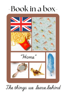
The book cover accurately reflects the books genre as the three contrasting colours (black, gold and white) reflect the themes of the story: the black, the most common and background colour, symbolises the death, mourning, grief and loss in the book; while the white and gold symbolise the purity of the characters and their hope and the gold could also represent the value of the “things we leave behind”.
In my opinion, the objects that stand out the most are the origami paper cranes, barbed wires and the golden feathers (all of which are gold), the origami cranes could represent a child's toy, and they stuck in the barbed wire, emblematizes that the children are stuck and therefore have no freedom; there are only two feathers and as feather symbolise freedom, this could signify that the children have little freedom.
The barbed wire goes in a spiral that leads to the center where you can see two young girls holding hands and looking at the horizon where the sun is rising. This symbolises new beginnings, new hope and in some ways rebirth.
I quite enjoyed how the gold really popped out and showed you the most important and significant parts.
The deeper meaning that the book cover represented and the overall art style of the cover drew me into picking this book as my book to read for the Carnegie project.
All in all, I think that the book cover portrays this book very well and has a very nice aesthetic.
Sophia
Treacle Town
he book cover is quite unique. I haven’t seen a cover with so many light colours in a while, but I don’t find it particularly attractive even if it is eye-catching. The colours clash together and I'm not a fan of real people on book covers - but I guess that’s a more personal preference. The images look like a collage to me and i don’t know if I like it or not. However the blurb was appealing to me. The writing on the back is clear and flows smoothly. I like the big writing on top and smaller on the bottom, it catches your eye and once you start the sentence you need to finish it. (And the presentation of the title is fun). The writing style in the book surprised me. I have never read a book written with an accent - and I like it more than I thought I would. The author spells words like he’d say them and uses phrases like “a wee lad”. I do believe the book cover reflects the story. We can see four characters in a town and I think it’s safe to assume they represent the main characters of the book in their small town. The light and warm colours of the cover give a calm feel (but it kind of makes me feel sad). I didn’t really want to read this book, it’s the opposite of what I usually look for when picking a book to read and it was my friends who convinced me to pick this one, but after reading a few chapters, I'm hooked.
Margot
Treacle Town
At first glance, does this book seem striking or catch my eye? Yes, but did it really communicate what was about the book? Not really.. It’s a different approach, sure, and original, but not what I expected. The cover is nice, it’s visually striking, it’s bold, it’s pretty but again I thought it would be about something joyful and uplifting but I guess I shouldn’t have judged a book by its cover. But I think we can all agree we have judged a book by its cover multiple times. Anyways, what struck me about this book was the colours, often bright colours like orange and yellow reflect joy which is a huge contrast to what the book is about. I would’ve expected some darker colours. Although it definitely doesn’t reflect the mood and genre of the book, the author might have been trying a different approach and I respect that.
The layout is also quite not my style, the title is quite big and leaves not a lot of space for the name of the author. Overall, even though it is visually striking, it isn’t my favourite book cover.
Deirdre
Treacle Town
At first, when I saw the cover of Treacle Town, I didn’t see the link between it and the storyline, until I actually stopped to think. The colours were bright and vivid. When I see orange, pink, and yellow, I think of sunshine, optimism, a mix of love, joy, and warmth. Not exactly the palette I’d associate with a book centred on gang violence.
But soon enough, I realised there was a second layer, a deeper meaning hidden in the popping colours and mixed-media design. I interpreted it as Brian Conaghan showing us what Con O’Neil, the main character, is reaching for: a better future. One full of joy. A better life. That really made me think about the power of a book cover and how much thought can go into something most people glance at for half a second.
I liked the contrast between the little group of friends in somber colours and the vibrant background. The bold font was a strong choice, though it does unfortunately remind me of the TFL font and dragging myself to school on 7 hours of sleep. But still, it works.
The blurb also does its job well. It gives you a clear idea of what you’re stepping into. Altogether: solid book cover, good blurb, great colours, and a design that actually means something.
Ariane
Treacle Town
Personally, when buying books, I tend to ignore the famous saying "Never judge a book by its cover". Yes I do know that it is not just for books.. Anyway, for me, the cover of a book plays a massive role in whether or not I get a book. The cover for Treacle Town stands out to me, as the colours and the way the text is presented is different from most other books I read. Although I do find that the colours contradict the story, I do like the fact that we can see the whereabouts that the book will be held. Personally, I'm not a huge fan of having people on the front cover as I find that it gives away part of the imagination and creativity that the reader has when they read a book, so the people on the cover is not a positive thing about the cover for me. Even so, when I first saw the cover, it grabbed my attention. The title is large and clear, with some effects that make it look faded and broken, which gives it a little more life. There are also patches of the book which also look a little worn out and damaged. I also really enjoyed the blurb as it's font seems to get smaller as the recap goes down. The blurb itself was intriguing, and it caught my attention, finalising my decision to read Treacle Town by Brian Conaghan.
Eloise
Treacle Town
Treacle Town is a gritty and atmospheric novel that explores the bleakness of a forgotten town through the eyes of a sharp and determined young boy. Despite being surrounded by poverty, violence, and despair, the boy stands out for his resilience and street-smart nature. His ability to read people, adapt quickly, and think ahead reveals a rare intelligence and strength of character. It becomes clear as the story progresses that he isn’t just surviving—he’s planning his escape. What makes Treacle Town so compelling is the way it shows that, even in the darkest environments, some individuals possess the skill and mindset to rise above it all. The boy isn’t just lucky; he’s prepared, and every choice he makes proves he’s capable of leaving Treacle Town behind for something better.
Romeo
The Things We Leave Behind
When I first looked at the front cover the first thing that popped into my mind was a dreamy, mysterious, sad and fantasy book. Then I turned the book to discover that what I believed, was nowhere near what the real story was. I read the blurb to discover a fictional, dystopian novel that tells the tale of two girls on a life changing, dangerous and treacherous journey. The dark blue background gave a sense of sadness or despair whereas the white and gold gave a sign of hope, joy and happiness. The title's lettering popped out of the page. The fonts, sizing and drawing helped the novel stick out to me in the different choices. Though I do feel the book would stand more online than on a bookshelf as the dark colours may not show along with all the rest of the books. Even though some details may help it stand out, I don’t think it’s enough to stand out in the crowd. It doesn't really show the clear point and plot of the book.
Maureen
King of Nothing
When I read the summary of King of Nothing, I found it very interesting. After reading half of the book I understand the story much better. First, it is very entertaining, which helped me keep the momentum, secondly I really like how Anton's life is, at the same time, very complicated (with his dad being in prison, with him getting in trouble at school, and getting a lot of pressure from the principal about the GCSE) and very easy.
And his life changes a lot throughout the book, with his unlikely friendship with Matthew. His role helping Matthew at school. We can say he feels teaching something to someone for the first time.
After almost finishing King of Nothing, I can say safely that I really recommend it!
Have a nice reading,
John
John
The Things We Leave Behind
After glancing at the cover, I was having trouble knowing what the genre is, as the dark colours gave the book a dreamy sense of mystery. However, after further inspection and reading the blurb, I found that The Things we Leave Behind is actually a dystopian novel where the characters, that are two sisters, go through many adventures.
The colours and design of the front cover remind me of the colour scheme of the night sky, with the background a mix between navy blue and jet black, and, resembling the stars, golden origami cranes caught on an equally golden barbed wire. This wire spirals around the title, which is written in big, white capitals, that stand out against the dark background. In the center of the cover, there is a yellow circle where we see the silhouettes of two girls, possibly sisters, holding hands, like a window of hope against the dark sky.
This cover attracted me because of its interesting design, even though it was slightly misleading in the start, I quickly understood after reading the blurb, which made me want to read it even more !
Margaux
The Things We Leave Behind
At first glance the title of the book jumped in my face, so that’s what I deciphered first with the letters being written vertically. I thought it was a dreamlike title that I quite liked and the cover seemed rather attractive.
When I looked at the front cover, I thought the book was about a sort of mysterious and dreamy story, though I did understand it was fiction. Then I looked at the blurb and caught a sense of a dystopian novel, with notes of adventure and danger. To me the dark colour palette of the front cover makes the book look more like a mystery novel though the blurb tells otherwise.
The dark background resembles the night sky and its exact colour that balances perfectly between black and dark blue. I found it so calming. At first sight the golden origami birds looked like stars shining in the night sky. I find it has a dreamy effect especially with the golden barbed wire that spirals onto the soft image of two girls, possibly sisters. This round image resembles a moon at the center of this starry night. Amongst the sweet imagery of the cover, the barbed wire adds a note of danger. As I looked closer at the cover I was intrigued by this round image with the city skyline in the back. Could the night sky be a metaphor to the story or the genre of the book: so beautiful and harmonious but holding such danger and mystery?
Auriane
Treacle Town
Book cover review
I am not really a fan of the cover of Treacle Town by Brian Conaghan. In my opinion, the cover doesn't reflect the genre of the book. It gives a slight dystopian or post apocalyptic vibe, because the sky is yellow, and the boys are alone in what seems to be a lonely town. The story is called Treacle Town for a reason: it is hard to escape the town, you get trapped, stuck in sticky treacle. However on the cover, the town is represented with warm colours, and the boys are in black and white with tones of yellow, contrasting with the town behind them. They seem dull, when really it's the town that drags them down. When I first saw the book, the cover instantly caught my attention. Its bright colours and chunky bold fonts are very noticeable.
If there wasn't the blurb on the back that was very interesting, I don’t think I would have picked this book.
Amelie
Sekina